Explaining Love
Following my #lovedata challenge this morning, the first few attempts at explaining love around the world are already trickling in.
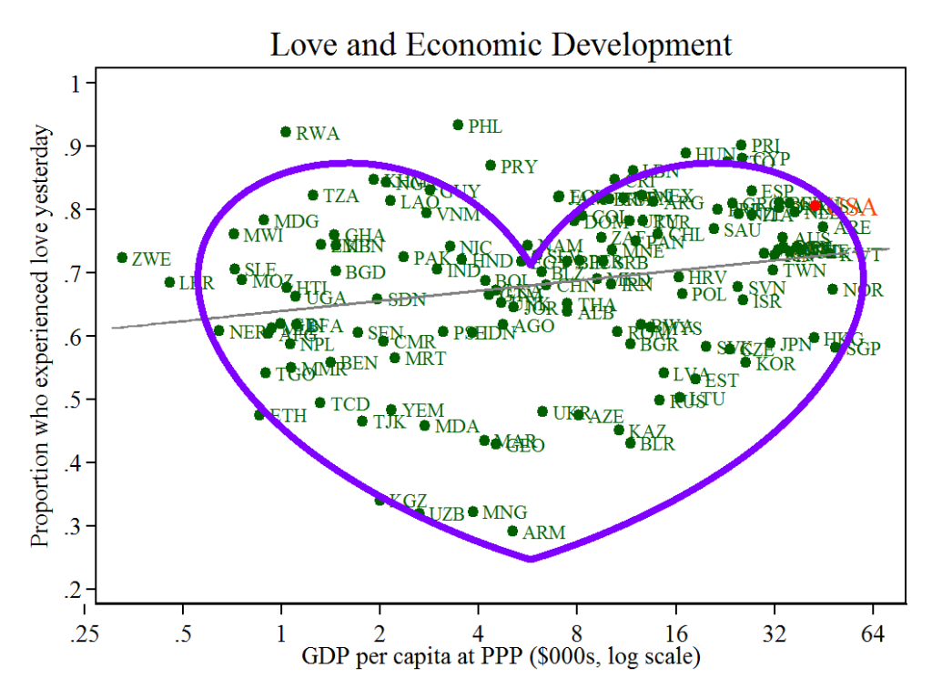
But first, the finding that blew my mind. Commenter Renars pointed out that the very data I had plotted—the proportion of people feeling love in a country on a typical day, versus a measure of GDP per capita (a measure of average income)–form a heart-shaped cloud. Really. Take a closer look at it. This may be the most amazing chart I’ve ever drawn.

And we’ve also got some other interesting results:
- For those thinking of using alcohol to loosen inhibitions, Jason Ruspini has news for you: The correlation between love and alcohol consumption is +0.03. Perhaps more striking, the correlation between love and fertility is mildly negative! (-0.04). And there’s good news: Love is negative correlated with mortality (-0.19).
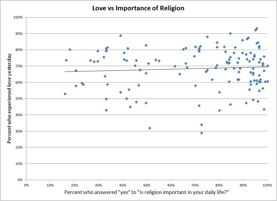
- My former student Brian O’Hara thought that religion might be part of the explanation. Alas, the importance of religion is basically unrelated to love:
@justinwolfers on a hunch I tried #lovedata vs importance of religion. (via bit.ly/acYWP8) Not the answer. — Brian O’Hara (@Brian_OHara) February 14, 2013

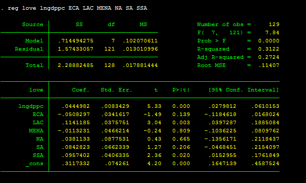
- And Tom McDermott found some interesting regional patterns in the data. Latin American and Caribbean countries experience a whole lotta love, as does Sub-Saharan Africa.
@justinwolfers Some regional bias – controlling for GDP per cap, LAC and SSA more loved up than the rest! #lovedata — Tom McDermott (@Tom_Mc_D) February 14, 2013

- And Pierre-Louis Vezina has a whole blog post of interesting correlations, here. There’s more love in countries with greater inequality and less military spending.
OK, correlation may not imply causation, but still: Fascinating stuff. Keep ’em coming!

Comments