Is Higher Income Inequality Associated with Lower Intergenerational Mobility?
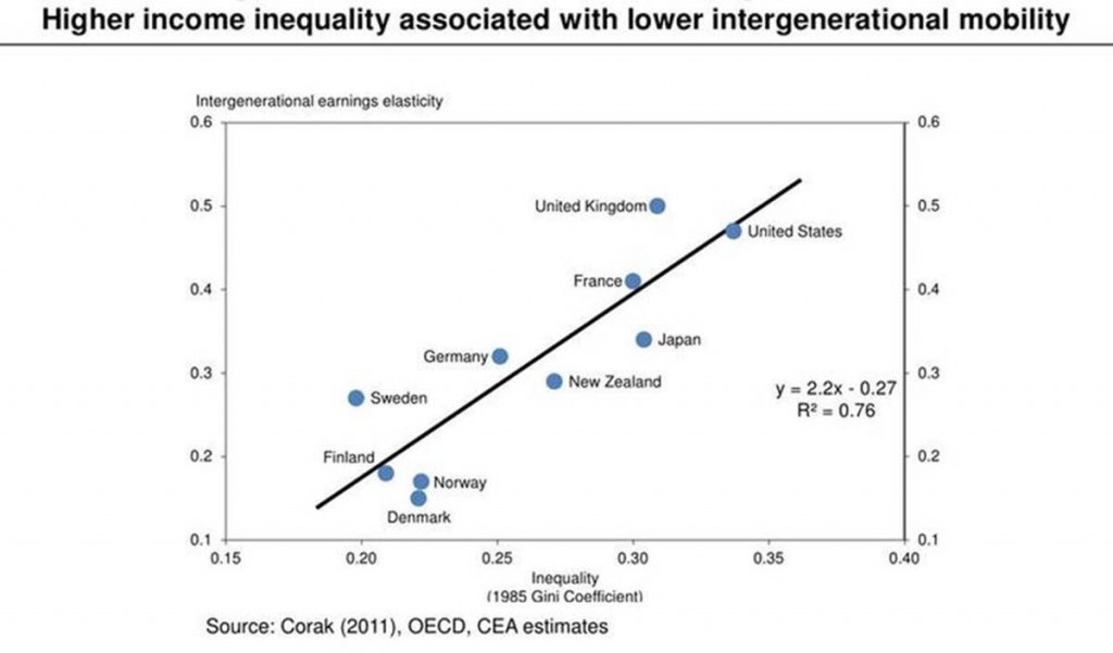
A lot of our political debate boils down to questions about equality of outcomes versus equality of opportunity. But it turns out that they’re pretty closely related. Take a look at the chart below, which is from a terrific recent speech (with charts!) by Alan Krueger:

The horizontal axis shows the Gini coefficient, which is a summary of the degree of income inequality for each country. I think of this as a measure of inequality of outcomes. The United States sits out there on the right, which says that we have high inequality, which I bet that doesn’t surprise you.
The vertical axis shows a measure of intergenerational mobility, which summarizes the relationship between your income and your parents. A score of zero means that we have equality of opportunity — the kids of rich people earn as much as the kids of the poor. A high number means that the rich parents have rich kids and poor parents have poor kids. The U.S. has a score of 0.4 which means that, on average, you pass on 40% of your economic advantage to your kids: if I earn $100,000 more than you, then on average, my kids will earn $40,000 more than your kids. So I think of this as a measure of inequality of opportunity. You’ll notice that the U.S. also scores high on this measure. Americans are often surprised to learn that in the land of opportunity, your life outcomes are largely determined by your parents.
It’s striking just how closely related inequality and mobility are. And it’s political dynamite. Why? If income inequality in one generation can be linked to unequal opportunity in the next, then income inequality can’t just be dismissed as the politics of envy. My bet is that this chart that will launch a thousand papers, as economists try to sort out just what these linkages are. Whatever the answer, it will transform our thinking about inequality.
But in the political arena, the first instinct is to deny. And so not surprisingly, this chart has led to a wonk-fight. If you want the dirty details, here’s Scott Winship’s critique, Miles Corak’s reply, Winship’s counter, and Corak’s response. I score this fight for Corak. It’s not even close: he’s the leading figure in international comparisons of mobility, and he’s put together the best data around. Other authors and other datasets yield the same conclusions.
There’s a broader lesson here for what we learn from these sorts of data debates. Basically, Winship has a bunch of complaints about how the data are constructed — and many are valid. He says that it’s difficult to construct internationally comparable measures of income inequality – that the chart should use inequality from an earlier era, and that only some types of inequality would generate immobility. He also points out that mobility is difficult to measure: the data come from different countries with different researchers using different methods. It’s a standard play from the wonk-fight playbook: throw lots of mud at the data, and hope that this leads people to mistrust the conclusions that follow.
Here’s the thing: his criticisms actually strengthen the original finding.
Think about it. Imagine how strong the “true” relationship must be if it shows up even when using only rough proxies for the “true” levels of inequality and immobility. In light of Winship’s criticisms, the high correlation in this chart is all the more remarkable. If his gripes are correct, then graph understates the correlation between inequality and mobility.
Now there’s one more possibility to consider. If mis-measurement of inequality were related to mis-measurement of mobility, then the chart could reflect correlation in these measurement errors. But the two measures come from different datasets, different researchers, and different methods — so that’s pretty unlikely. And the measurement errors involved aren’t big enough to drive a correlation this strong.
Predictably enough, I spent yesterday reading lefty blogs trumpeting Corak’s analysis, and right-leaning blogs who didn’t want to believe the inequality-mobility link, endorsing Winship. But both missed the bigger picture implications. Either you’re convinced by Corak that the data can be trusted, and that they show there’s a strong link between actual inequality and actual mobility. Or you believe Winship that the data are a pretty poor proxy for what’s really happening, and so there’s actually a very strong link that’s being disguised by imperfect data.

Comments