Where Did All the Runs Go in Major League Baseball?
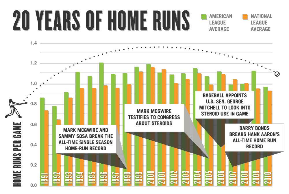
Infographic illustrated by Bad Feather
The Year of the Pitcher?
One of the ongoing stories of this baseball season has been a mysterious decline in runs scored. Major League Baseball teams are scoring an average of 4.4 runs per game, the lowest mark since 1992 and a drop of more than 1,000 runs since last year alone. As offense has declined, pitching performances have made headlines. Five pitchers threw no-hitters in 2010, and three of those were perfect games in May and June from Dallas Braden of the A’s, Roy Halladay of the Phillies, and the Tigers’ Armando Galarraga. (Galarraga’s feat was taken away by an umpire’s admitted blown call on what would have been the last out, but we’re choosing to give it to him.) The perfect game is one of the rarest occurrences in sports, and yet the 19th, 20th, and almost the 21st perfect games in baseball history all occurred within 23 days. Because of the single-game performances and the overall scoring drop, sports reporters quickly labeled this season “The Year of the Pitcher.”
The Twist
But for a so-called “Year of the Pitcher,” the pitching around the league hasn’t actually been that great. In fact, it’s not much better than last year, and in some important categories, it’s gotten a little worse. In the American League, strikeouts per nine innings, which many experts consider one of the most reliable measures of pitching excellence, have gone down this year. Fielding Independent Pitching (xFIP), a geeky metric that uses stats to isolate a pitcher’s performance from the fielding around him, has improved from 4.38 to 4.25, but that’s nowhere near enough to explain the drop in run production. This year’s xFIP is about the same as it was in 2005, when scoring was much higher. So if pitching isn’t actually better, how can we explain the drop in scoring? Interestingly, not all of baseball is suffering from fewer runs: the decline has been limited almost completely to baseball’s American League. AL teams are scoring .37 fewer runs per game, from 4.82 to 4.45; National League teams, meanwhile, have only reduced their scoring by .04 runs. Of the drop of 1,105 runs in the major leagues from last year, the American League has been responsible for a whopping 823 of those. Pitching in the AL, like in the rest of the league, hasn’t improved much this year, but fielding has made a substantial leap forward. Defensive Efficiency, a stat that measures the percentage of batted balls that are converted to outs, has jumped from an average of .689 in 2009 to .696 in 2010. Fielding is arguably the most frequently forgotten dimension of baseball, but it may be time to examine its effect on overall scoring. To figure out whether pitching or fielding is more responsible for the scoring drought in the American League, we need to isolate them from each other. To do that we’ll use two advanced metrics: xFIP, the stat that predicts pitching without fielding, and Defensive Efficiency, the fielding-without-pitching stat. We gather xFIP and DE data for each AL team in 2009 and 2010, and then compare the change in each stat to the change in their runs scored per game over the same time frame by running two statistical regressions. Using these regressions, we can see which stat correlates better with the change in runs scored. The higher the “r-squared” figures on the graphs below, the more closely correlated the two stats are with each other.
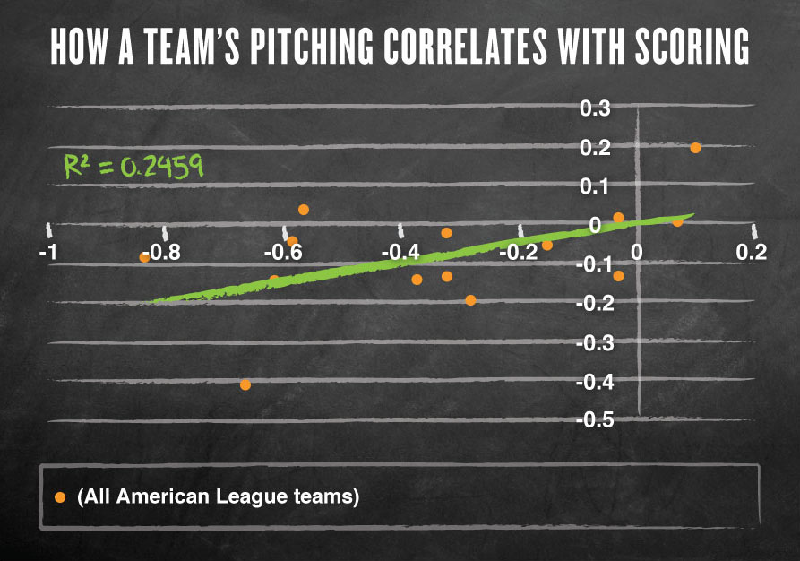
Since the R-squared figure in this chart is lower than in the fielding chart, we can figure that fielding, rather than pitching, is more closely linked to runs
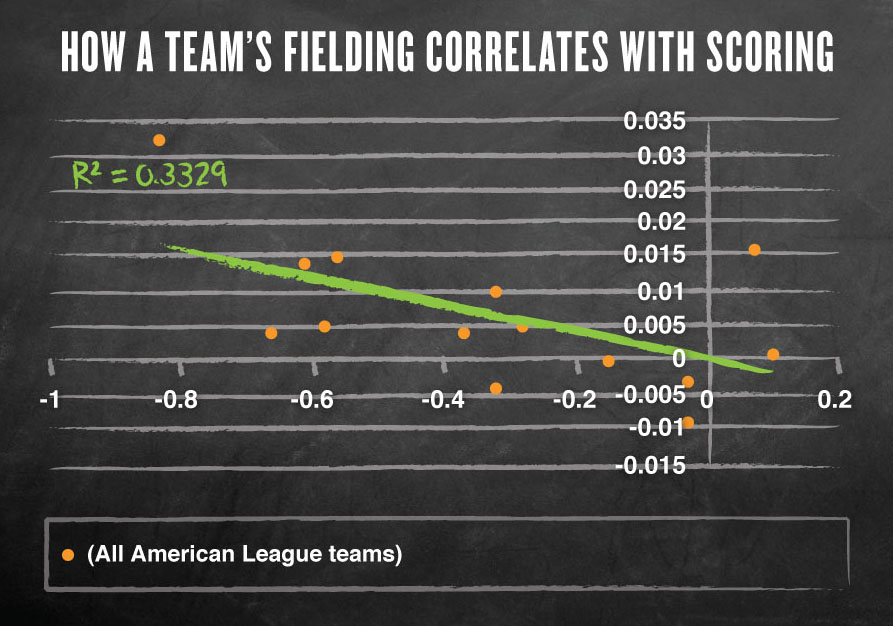
The higher the R-squared figure, the better the correlation
The Results of These Regressions
As we can see, these regressions suggest that the fielding stat, with its r-squared of .333, correlates better with the overall runs scored numbers than the pitching stat does. This basically means that changes in fielding are more likely to have influenced the scoring trend than changes in pitching. The problem with a regression like this is that we only have 14 points on each chart, one for each AL team, and a sample size that small doesn’t really hold up under scientific scrutiny. So let’s do it again, this time using as our sample the 92 pitchers who threw at least 80 innings in the American League both this season and last season, from A to Z (or, in the world of AL pitchers, from A.J. Burnett to Zack Greinke.) We’ll compare the changes in how they pitched from this year to last year to the change in their runs allowed, then we’ll do the same for the change in how their fielders performed behind them and their runs allowed. Again, we’ll see which stat correlates better with the changes in scoring. One hitch: Defensive Efficiency isn’t collected for individual pitchers, so for our fielding statistic we’ll use BABIP (Batting Average on Balls in Play) as our defensive stat. BABIP calculates the percentage of balls hit into play that were hits. So if half of the balls hit into play off a pitcher result in a hit, that pitcher’s BABIP would be .500 (.295 is about average). It’s not an ideal statistic, because it doesn’t count errors as hits, thereby punishing the hitter for an error when we would prefer to punish the fielder. So to cancel that out we’re correlating the statistics with ERA instead of Runs Scored, because ERA only counts earned runs and therefore is lower among defenses that commit more errors.
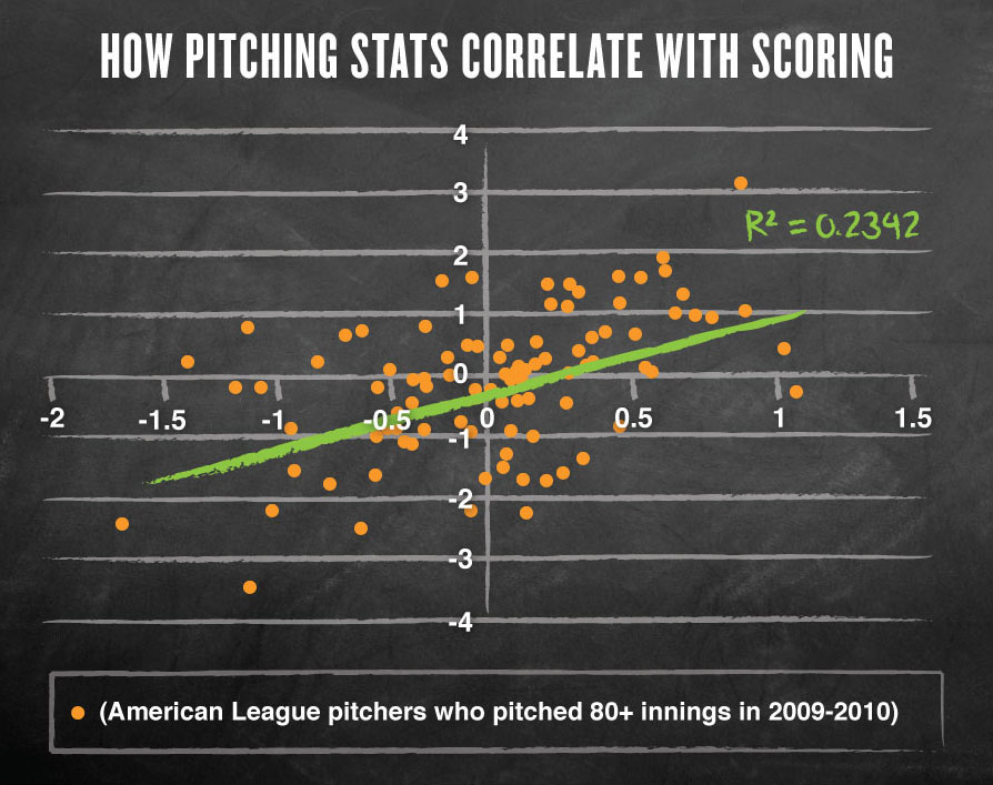
Comparing a change in ‘Expected Fielding Independent Pitching’ (tracks a pitchers’ performance) to a change in Earned Run Average (tracks the number of runs scored)
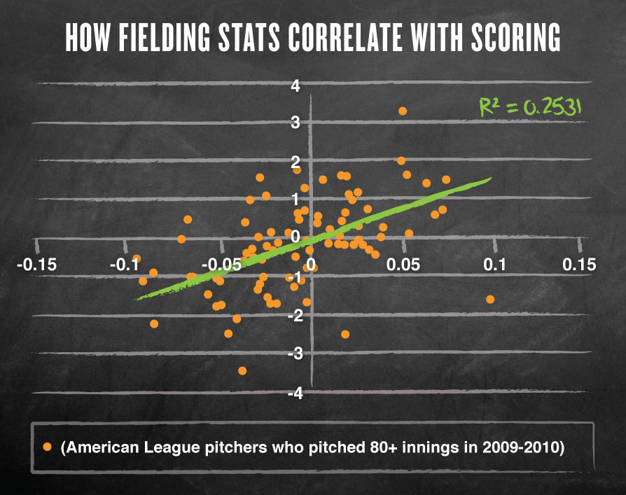
Comparing a change in ‘Batting Average on Balls in Play’ (tracks fielding performance) to a change in Earned Run Average (tracks the number of runs scored)
Results of the Pitcher Regressions
Though the margin is smaller this time, the fielding statistic again explains more of the change in scoring than the pitching statistic does. This is especially notable because xFIP is designed to predict ERA, but xFIP still doesn’t correlate as well with ERA as BABIP does. The numbers continue to suggest that pitchers benefited significantly from improved fielding in 2010. A good example of such a pitcher is Gio Gonzalez of the Oakland Athletics, who improved his ERA from 5.75 in 2009 to 3.23 in 2010, a massive drop of 2.52 points. But in the same time, Gonzalez’s xFIP actually grew .16 points, sugg
esting that he didn’t pitch as well this year as he did last year. This year, however, the A’s became far and away the American League’s best defensive team, raising their Defensive Efficiency from .683 to .715. That’s a huge jump for the A’s fielders, and it seems like Gonzalez reaped the benefits. It’s not crazy to blame the scoring drought on fielding improvements: great fielders often contribute doubly to reduced scoring rates in their second role as below-average hitters. The 2010 Mariners are a good example: they added defensive tools in the off-season and continued to be one of the better fielding teams in the league this year, but their offense fell from the worst in the league in 2009 to one of the worst of all time in 2010. So when you’re putting a great fielder in your lineup, you’re also usually hurting your own offensive production, effectively reducing overall scoring on both sides of the ball. So it appears that fielders have steadfastly frustrated opposing offenses (and their own) all season long, only to see all recognition go to the lonely pitcher. Let’s give them the credit they deserve: this has been their year.
Hayes Davenport, who provided research for the “Year of the Glove” segment on “Marketplace,” is a staff writer for Comedy Central’s “Big Lake” and “The Nick Swardson Sketch Show.” He is a certified stathead: his senior thesis at Harvard (from which he graduated in 2009) was called “Anti-Rationalist Rhetoric in American Baseball Journalism.”

Comments