Is Income Inequality Rising, and Are a Lot of Feathers Heavy?
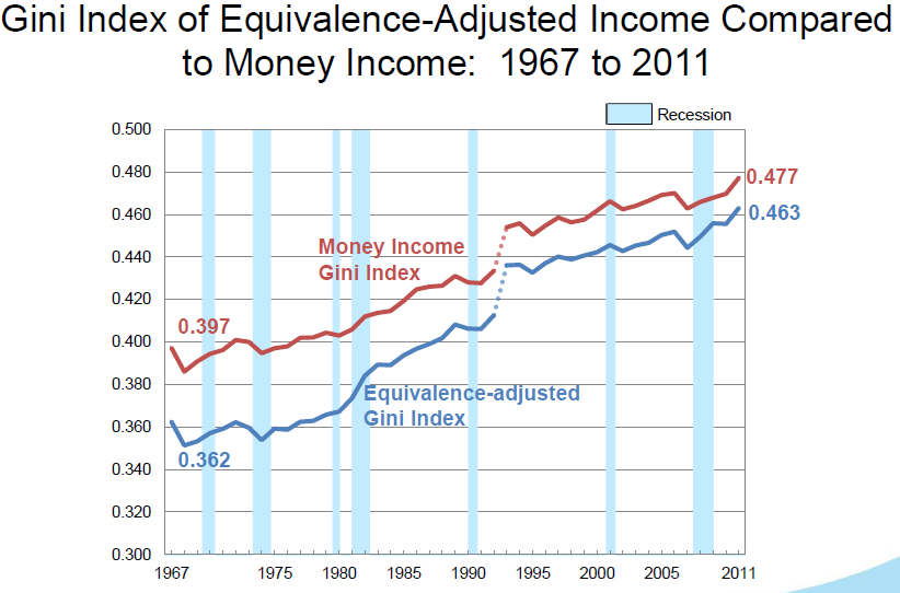
New data on income inequality in the United States were just released. And they provide a useful teaching moment. The graph below, which comes from the Census Bureau, shows the evolution of the Gini coefficient since 1967. It’s pretty clear that this measure of inequality has been rising pretty much through this whole period.

But here’s how the Census Bureau chose to describe these data:
Based on the Gini index, income inequality increased by 1.6 percent between 2010 and 2011; this represents the first time the Gini index has shown an annual increase since 1993, the earliest year available for comparable measures of income inequality.
Say what?
It turns out that they’re looking only at year-to-year changes. And they’re counting a year-to-year change as positive only if it measures inequality this year as being statistically significantly larger than it was last year. And while inequality rose in most years, it may not have risen by enough over any one year to be called statistically significant.
Yet while the Census Bureau may be right that no individual year-to-year change was statistically significant, the accumulation of positive changes is. That is, since 1993, the number of times inequality has risen, is itself statistically significant. Alternatively, if you compare inequality today with that more than a year or two earlier, the rise both this year and in most years is statistically significant.
Over on Twitter, Alex Tabarrok had a nice way of summarizing the mistaken logic that led the Census Bureau to make such a misleading statement:
Census: Feathers are light therefore lots of feathers are also light.
His point: Each year-to-year change in inequality may not be that significant of a burden, but accumulating a bunch of them over decades really is.
Bottom line: Your eyes don’t deceive you, inequality is rising. And think hard about what statements about statistical significance are really testing.

Comments